What Really Goes Into a Good Logo?
What makes a great logo: Crafting brand-defining symbols that resonate and endure over time.


In the ever-changing world of business and marketing, having a compelling logo is a game-changer. Imagine it as the superhero of visual identity for a brand — strong, memorable, and totally embodying the essence and values of a brand. It is a powerful tool in the arsenal of brand recognition, making a lasting imprint in the minds of consumers — catapulting a brand into the realm of instant recognition and familiarity.
Let’s walk through the art and science of logos and how they create an emblematic symbol that becomes the hallmark of a brand’s unique identity.
Brand Identity: The Collection of Brand Identity and Visual Identity Elements
We need to first understand the groundwork of a Brand Identity — a collection of Positioning, Name, Tone of Voice & Messaging, Logo, Typography, and Color that collectively define a brand’s identity. In a recent workshop I attended hosted by branding and type studio, Hoodzpah, the argument was made to consider categorizing all of these components into 2 camps:
This comprehensive definition unfolds in layers, beginning with the Brand Identity Elements, that is comprised of Positioning, Name, Tone of Voice & Messaging. These crucial pieces contribute to the brand’s personality, crafting the brand’s essence that will resonate powerfully with its audience.
Simultaneously, the Visual Identity Elements, where the logo stands tall alongside a carefully curated typography, color palette and brand elements. As a cornerstone, the logo becomes the visual anchor that ensures a seamless and recognizable brand identity across various touchpoints.
“Branding is the act (verb) of trying to shape and control a brand. Brand Identity is the result of this activity (noun).” — Hoodzpah
The Foundation: Strategy and Discovery Phase
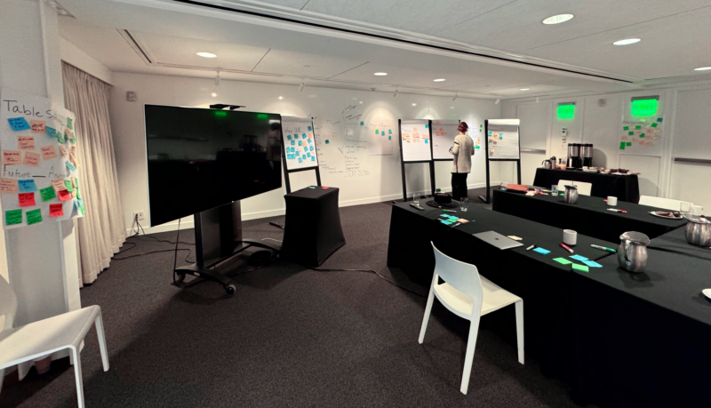
Now, embarking on the journey of logo design, a foundation must first be laid through a meticulous Strategy and Discovery Phase. Here, the pivotal role of client collaboration takes center stage, underscoring teamwork and ensuring that the resulting logo is a true reflection of the brand’s identity.
This collaborative stage delves into understanding (or establishing) the brand’s values, mission, and the nuanced characteristics of its target audiences. Also, identifying industry trends as well as a competitive analysis becomes imperative, providing the groundwork for the subsequent design phase. Completing discovery and strategy hand-in-hand with the client charts a course that aligns forthcoming design-work seamlessly with the brand’s overarching strategy. This approach not only fosters a profound understanding of the brand, but also sets the stage for a purposeful and impactful logo design process.
Colors, Fonts, and Shapes: Crafting the Perfect Combination
The harmonious blend of Colors, Fonts, and Shapes emerges as an artistic symphony, creating a logo that resonates and captivates.
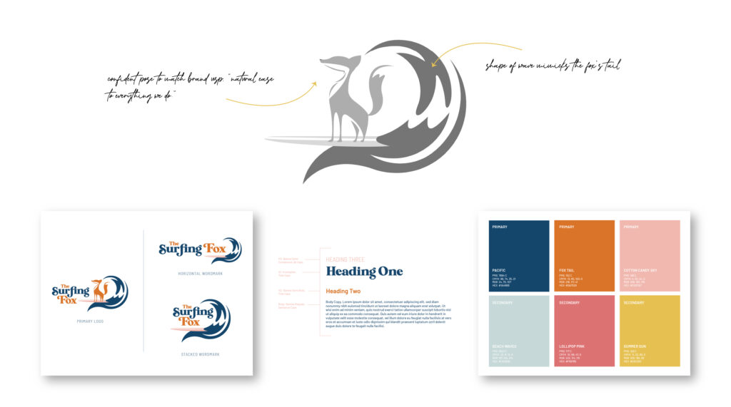
The most crucial step: the process of experimenting with shapes by sketching and ideating before jumping straight into Illustrator. This foundational step not only unleashes the creative spirit but also allows designers to explore diverse shapes, lines, and structures on paper. The tactile engagement of sketching serves as a playground for ideas, providing a tangible canvas where innovation knows no bounds. This analog exploration is more than a preparatory step; it is the genesis of unique logo concepts. The act of experimenting with shapes through sketching not only refines design ideas but also sparks a cascade of creativity that lays the groundwork for a logo that is not just visually striking but also conceptually rich.
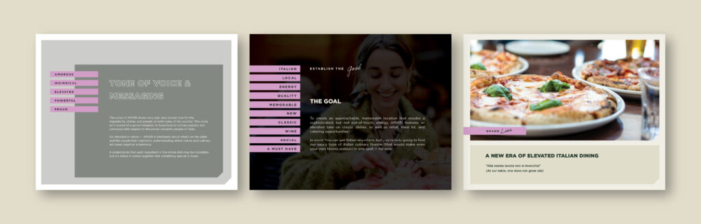
Selecting typography can be tricky. The designer needs to strike a balance between readability and uniqueness, while ensuring the wordmark is not a carbon copy of the font – losing its singularity (even customizing one letter is a solid way to create distinction). I often find after sketching first, I have a better idea of the font or custom type I’d select for the project.
The importance of curating a unique color palette cannot be overstated, but achieving a thoughtful selection of colors goes beyond mere aesthetics. The ideal palette would have balance and harmony, while also supporting the brand’s personality – evoking emotions and establishing a connection with the audience. To streamline this intricate process, tools like Coolors.co provide a creative playground for designers to experiment with various color palettes, ensuring a perfect blend that captures the essence of the brand.
As designers embark on the journey of selecting type, colors, and form for logo design, it’s not just about visual appeal; it’s about strategically weaving a tapestry that resonates with the brand and speaks to its audience, creating a visual identity that stands the test of time.
A Case for Simple Logos
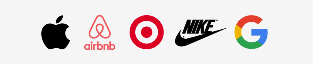
Simplicity and versatility emerge as paramount, as a minimalist approach not only enhances visual appeal but also ensures adaptability across diverse platforms. In the ever-evolving landscape of logo design, the mantra “simplicity wins” stands as a robust defense for timeless, “simple” logos. A compelling argument in favor of simplicity in logo designs stems from the recognition that clear and straightforward visuals tend to resonate more profoundly with audiences. The power lies in using simple brand themes repetitively and consistently until they become not just recognizable but also deeply meaningful to the consumer. This repetition breeds familiarity, and in turn, fosters a sense of trust and connection. In a world saturated with visual stimuli, a simple logo has the capacity to cut through the noise and leave an indelible mark. It’s not just about minimalism; it’s about the enduring impact that simplicity imparts, creating a visual identity that transcends trends and stands the test of time. Take Apple, Nike, and Google, for example: while rejecting unnecessary over-sophistication, these logos are considered some of the best because of their simplicity.
A Case for Complex Logos
A truly timeless logo, on the contrary, can transcend fleeting trends, solidifying its enduring presence. Often, a brand’s rich history, values, and legacy are tied to an intricate design, and the designer will need to balance advocating for the enduring value of an elaborate logo.
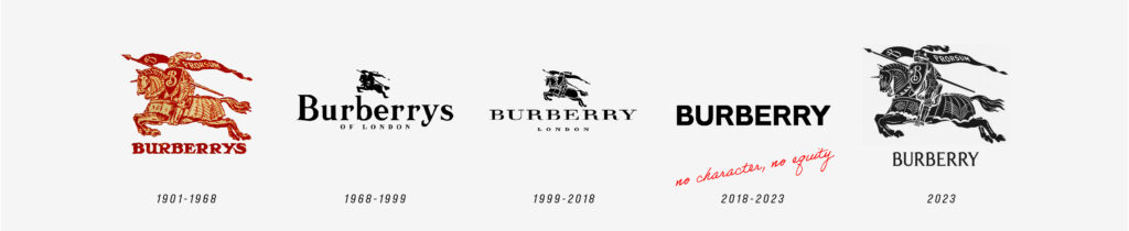
The notion of rebranding a logo into ‘modernity,’ but in turn losing brand equity, is a failure. While ‘design trends’ may seem tempting, they are not always the best solution for clients seeking a lasting and meaningful brand identity. Elaborate logos can offer a timeless visual representation that stands the test of time. A prime example of this principle can be witnessed in the Burberry rebrand iterations. After succumbing to ephemeral design trends, Burberry chose to embrace the essence of its iconic emblem, showcasing that a thoughtful and elaborate approach can breathe new life into a brand without compromising its heritage. This stands as a testament to the idea that maintaining brand equity through a meticulous and meaningful design strategy is a far more sustainable path than chasing transient modernity.
Lasting Impressions
From the basic elements of brand identity to the harmonious blend of colors, fonts, and shapes, the linchpin in the entire brand identity symphony is the logo, playing a pivotal role in unifying these diverse elements into a cohesive whole. As designers, we are tasked with the responsibility of crafting logos that transcend trends, capture the essence of brands, and, above all, creates a lasting connection with the audience.
Is your brand in need of a logo design or refresh that infuses your brand identity with depth, character, and interest? Our team would be happy to help!
Most Recent Posts