
The Challenge
A City Worth Knowing and Seeing.
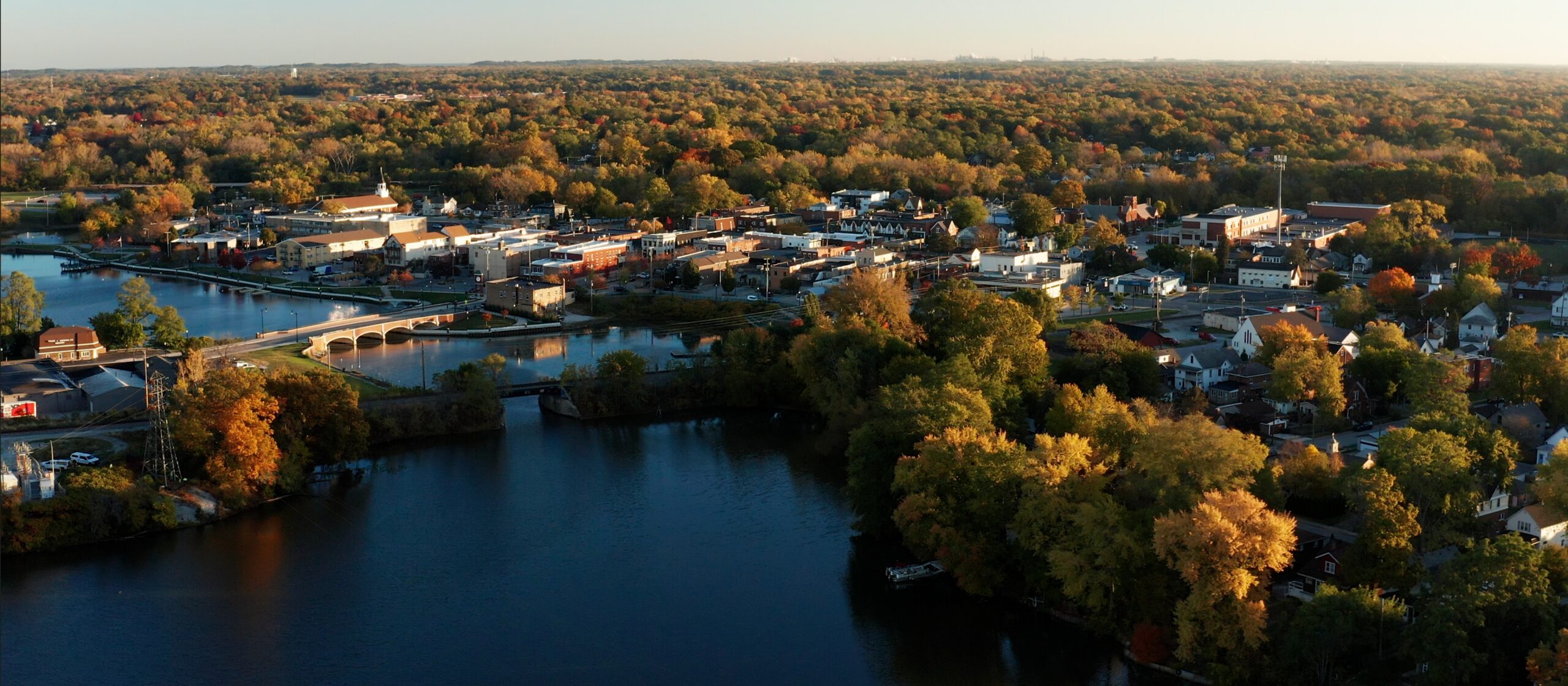
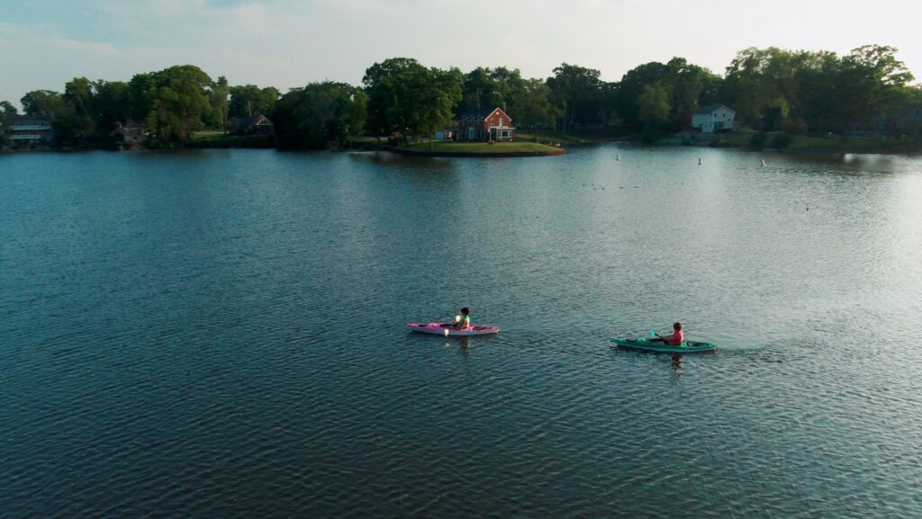
Hobart is the kind of place that holds onto people. Lake George runs through downtown, a dining scene that keeps people at the table, County Line Orchard draws visitors from across the region, and the community has been here long enough to have genuine history. The story was always there, it just needed a brand strong enough to tell it.
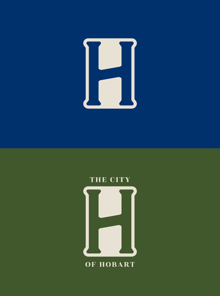
Across the city, visual identity was inconsistent. The logo that once represented the city, featuring a clock tower, did little to communicate the true heart and soul of Hobart. Mayor Josh Huddlestun saw an opportunity: one unified brand the whole city could own, anchored by narrative videos that could bring the story to life.
HOBART ALREADY HAD IT, IT JUST NEEDED A BRAND THAT COULD TELL IT.
Small city branding is a different kind of beast than corporate or regional campaigns. The audience isn’t just a target: it’s the people who live there, the business owners who stake their livelihoods on it, and the city departments that have to carry the brand every single day. It had to work for all of them.

What We Did
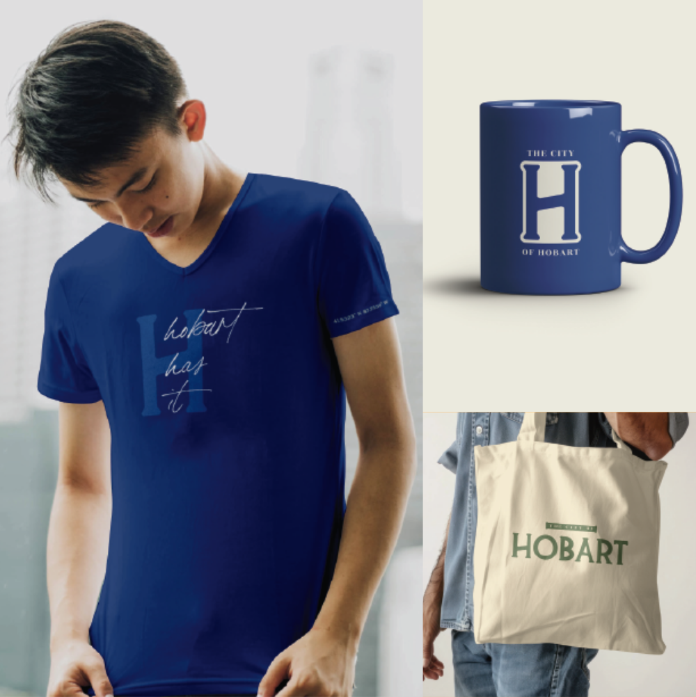
Giving Residents Something to Carry.
A small city brand has two jobs: give city hall a coherent identity, and give residents and businesses something they actually want to wear, share, and put in their windows. We rebuilt Hobart’s logo system around a flexible H-mark that anchors every department, so parks, recreation, and the city itself finally speak the same visual language. Then came the united concept that rallied a new brand direction:
Hobart Has It.
Three words, infinite extensions. Hobart Has Coffee. Hobart Has Fall. Hobart Has Heart. The brand soft-launched at the State of the City address in April, with Mayor Josh delivering it from the podium to a room full of residents. A multi-video campaign followed: dedicated 30-second cuts for dining, nature, local attractions, and economic development, anchored by a brand anthem that stitched the full story together. The city became a participant in its own marketing, and residents had something to stand behind that actually felt like them.
Brand Identity System
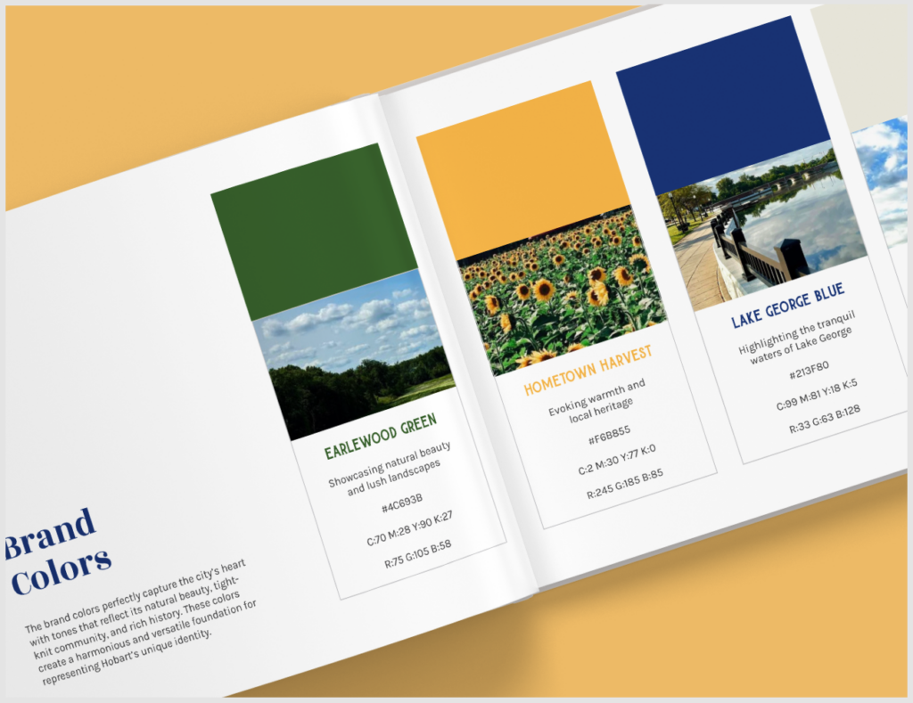
Flexible H-mark, department applications, stationery, signage, and a complete brand book that gives every corner of city hall a shared visual language.
Hobart Has It Campaign
A taggable, extendable campaign line built to work for residents, businesses, schools, and designed to live far beyond the launch.
Brand Anthem & Video Series
A brand anthem plus 30-second cuts for dining, nature, attractions, and economic development — each carrying the Hobart Has It line in a different context.
State of the City Launch
The brand soft-launched at the mayor’s State of the City address in April, putting it directly in front of residents, business owners, and city leadership at once.
The Result
The Clock Tower Ran Out of Time.
Core Brand Pillars
Community Pride, Unique Attractions, and Dynamic Living, gave every campaign extension a shared foundation.
Videos Produced
A brand anthem plus dedicated cuts for dining, nature, attractions,and economic development
Campaign Line
Hobart Has It, built to live on t-shirts, window decals, the mayor’s keynote, and a 30-sec brand anthem all at once
The new brand soft-launched at the State of the City address to positive feedback from residents and city staff. The dining video went on to be shared by local business owners. Hobart Has It became the campaign line that residents, businesses, schools, and city departments could all put their name on, because it was built for all of them from the start. The clock tower stepped aside, and the city finally had a brand that could carry its weight.

If You're Trying to Tell a Regional Story, We Know This Territory.
Whether you're positioning a place, marketing what makes a community worth investing in, or helping decision-makers see what they've been flying past, that's the kind of work we do and where we tend to do it best.